Introduction: That Frustrating Feeling
The frustration is a universal digital experience: the subscription that won't cancel, the hidden fees that appear at checkout, the pop-up that shames you for declining an offer. These are not user errors or technical glitches; they are meticulously crafted design choices intended to manipulate you.
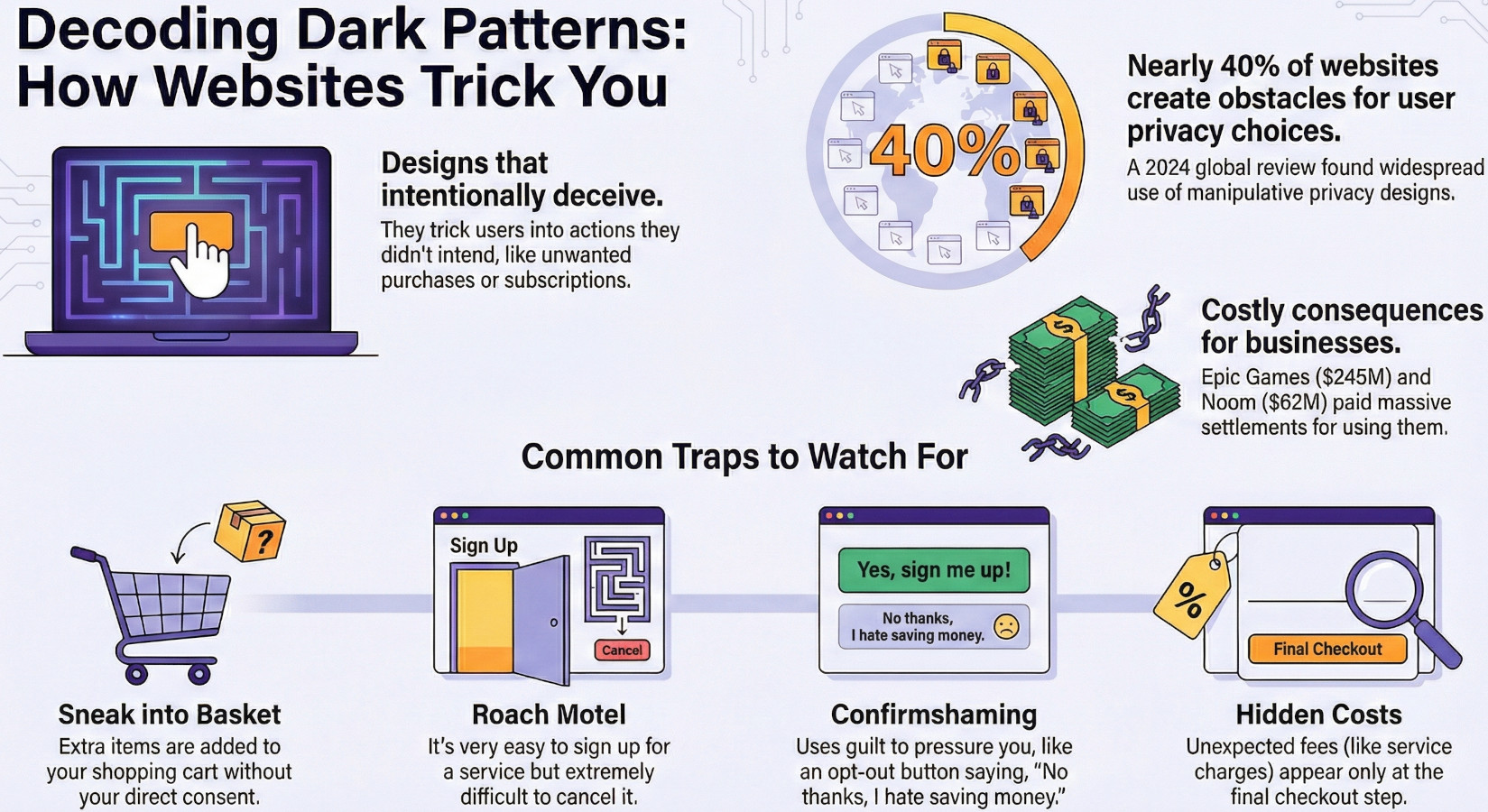
These practices are known as "dark patterns," a term coined by user experience designer Harry Brignull in 2010. They are user interface designs on websites and apps engineered to trick you into making decisions you didn't intend, from sharing excessive personal data to signing up for recurring bills. These manipulative tactics exist on a spectrum, ranging from subtly nudging you towards a specific action to outright deceiving you. Unlike ethical design, which prioritizes user autonomy and clarity, dark patterns exploit our cognitive biases to put business goals ahead of your well-being.
This analysis will expose five of the most pervasive dark patterns you encounter online. By learning to identify their underlying psychological mechanics, you can better spot and resist them, reclaiming your control in the digital world.
1. The "Sneak into Basket" and "Hidden Costs" Combo
The "Sneak into Basket" dark pattern involves a business automatically adding extra items to your online shopping cart, such as travel insurance or an extended warranty, without your explicit consent. You are then forced to notice these additions and actively opt out. This tactic is frequently paired with "Hidden Costs," where junk fees, service charges, or delivery fees are deliberately concealed until the final step of the checkout process.
This combination is dangerously effective because it targets you at the point of maximum commitment. By the time these unexpected items and fees appear, you have already invested significant time and effort in the transaction. This exploits the sunk cost fallacy—our reluctance to abandon a process we've already poured resources into. Both tactics prey on our commitment bias, making it psychologically easier to accept the new charges than to abandon the purchase and start over, which is precisely what the designers are counting on.
2. The "Roach Motel": Easy to Get In, Impossible to Get Out
The "Roach Motel" dark pattern is named after the classic pest trap: it makes getting into a situation, like a free trial or a new account, incredibly simple, while making it nearly impossible to get out. The cancellation or account deletion process is deliberately made confusing, obscure, and full of friction.
This design is particularly common with subscription services, which rely on trapping users in unwanted financial commitments. The goal is to make the path of least resistance a paid subscription, exploiting user inertia and frustration.
...free trials seamlessly roll into paid subscriptions unless you meticulously navigate a difficult cancellation process.
This pattern is deeply harmful because it preys on users either forgetting to cancel or giving up in the face of a convoluted ordeal, leading to unwanted recurring charges. When you encounter a process that seems unusually difficult, recognize it as a deliberate trap and, as the source material advises, "persist in finding the clear exit."
3. "Confirmshaming": Using Guilt as a Design Tool
"Confirmshaming" is a manipulative tactic that weaponizes guilt-inducing language to pressure you into an action you might not otherwise choose, like signing up for a marketing newsletter. It undermines user autonomy by replacing a straightforward choice with emotional pressure, making the option that benefits you seem foolish or undesirable.
The most blatant examples phrase the decline option in a way that insults the user for their choice. Instead of a neutral "No, thank you," the button might read:
No thank you, I don’t like saving money.
This is an insidious form of psychological manipulation. By framing a rational decision—like protecting your inbox from spam—as an irrational one, the design exploits our basic human desire to not feel foolish. It is a direct assault on informed consent.
4. "Privacy Zuckering": When You're Tricked into Sharing Everything
Named after Facebook's Mark Zuckerberg, "Privacy Zuckering" is the practice of tricking users into sharing more personal information than they realize or intend. It is often achieved through confusing privacy settings, dense legal documents, and permissive default settings that make data exposure the path of least resistance.
For instance, a new smart TV may have default settings enabled that allow the manufacturer to collect and share your viewing activity with third parties, with only a brief, easily missed notice. Another common tactic is the use of pre-ticked boxes that automatically grant consent for data sharing or marketing communications, forcing you to be vigilant and manually opt out.
These dark patterns are designed to steer consumers toward the option that gives away the most personal information.
5. The Consequences are Real: Multi-Million Dollar Fines
Employing dark patterns is not just an ethical failure; it carries significant legal and financial risk. Regulatory bodies are cracking down on these deceptive practices, which are already illegal under powerful legislation. In the EU, regulations like the GDPR help ensure a fairer internet, while in the USA, the FTC Act is a major tool for enforcing rules against deceptive business practices.
This design is particularly common with subscription services, which rely on trapping users in unwanted financial commitments. The goal is to make the path of least resistance a paid subscription, exploiting user inertia and frustration.
The penalties are substantial. Two recent cases provide hard evidence of the serious consequences for companies that violate user trust:
The path to a healthier internet is built on four key pillars:
-
Epic Games: The FTC fined Epic Games $245 million for using deceptive patterns in Fortnite’s payment system to trick and trap consumers.
-
Noom: The diet app company paid $62 million to settle charges related to its deceptive subscription and auto-renewal practices, which made it difficult for users to cancel.
These massive fines demonstrate that regulators consider dark patterns a serious consumer harm, not a minor inconvenience. They are a clear signal that undermining user autonomy for profit is a practice with severe financial and reputational consequences.
Conclusion: Your Awareness is the Best Defense
Dark patterns are a pervasive and serious ethical problem in digital design. They are intentionally engineered to exploit our psychological vulnerabilities, undermining user trust and autonomy for corporate gain. While their manipulative nature can feel overwhelming, understanding how they work is the first and most powerful step toward digital self-defense.
By becoming a more vigilant digital citizen, you can reclaim your agency. Read carefully before clicking, be wary of pre-checked boxes, and always review your shopping cart before finalizing a purchase. Recognizing these patterns for what they are—deliberate attempts to manipulate you—transforms you from a passive user into an empowered one, capable of making conscious, informed decisions.
Now that you can see the patterns, how will it change the way you navigate the internet?